
The Socks Project
PRODUCT DESIGN | PACKAGE DESIGN
The Sock Project positions socks as the “king of fashion,” reclaiming their historical status from luxury item to must-have statement piece. Inspired by underdog narratives and standout brands, we’re redefining socks not as mere accessories but as expressions of comfort, power, and style.
Project Statement:
Create 3 modern, sleek package designs for the first launch that catches peoples eyes but does not take away from the product itself. The goal is fashion forward and different compared to other sock packages out there.
RESEARCH
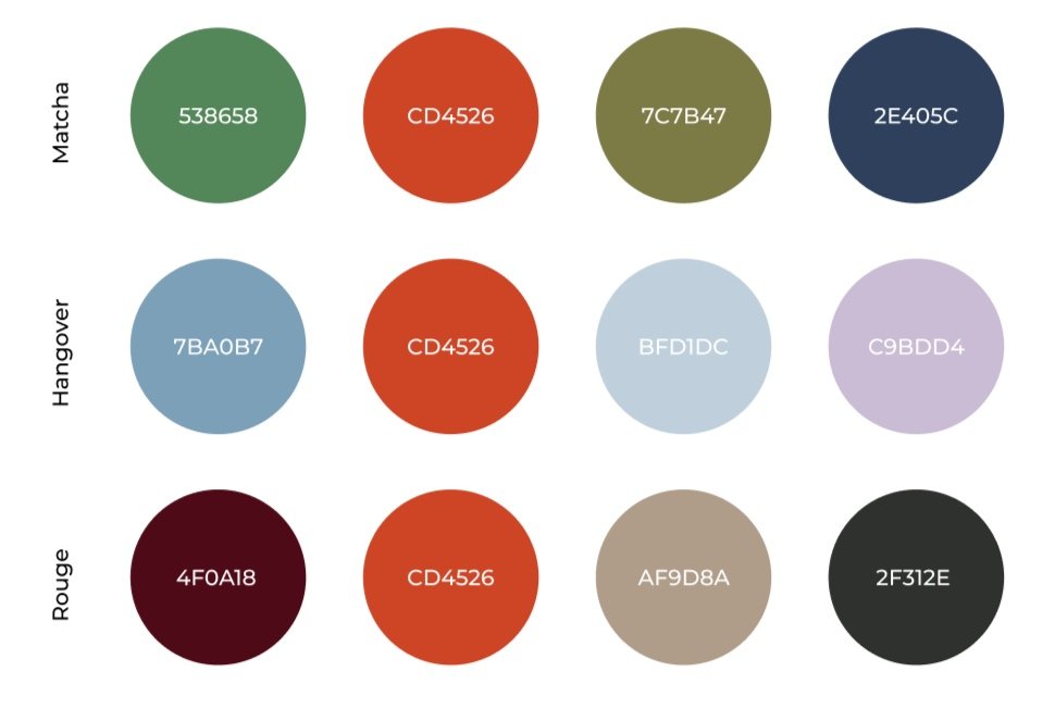
Since I was working with a start up, there wasn’t much brand direction visually. The plan for The Sock Project was to launch one line with 3 different sock designs: Chilly Matcha, Hangover Hustle, and Rouge Riot.
My job in all of this was packaging design. So, I worked with the founder to establish what he was looking for which was a mylar bag design with a simple design which was also fashion forward.
I started by doing some brand research on other companies with similar vibes and up bringings such as Nude Project, Liquid Death, and the London Sock Exchange.
MOOD BOARDS


Since I didn’t have much to work with at first, I started by reading the business plan and created some mood boards I felt matched what they were looking for best for each sock design. Across the boards, I kept a few of the same images to make sure each mood blended with each other since this was going to be one collective line. After that I met with the team and finalized our goals: Modern, simple, and possibly some character components while also putting a fun twist on it.
For the Hangover mood board, there were two directions we could have gone, lazy and tired or refreshing and upbeat. After much debate we decided that the tired, lazy color pallet (Hangover 1) worked best with the others.
SKETCHES
After a little more research on the actual package type itself (mylar bags), I got started on some initial ideas. Originally we decided we wanted to try out some characters doing different things on the different bags. We liked the first iteration for Chilly Matcha, however once I finished the other designs we came to the conclusion that the flat characters were giving more of a tech company feel rather than high fashion.

From there we talked about adding real photos to the bags. However, that would only be possible once we had the actual product in production already. So I came up with a new plan: Create a package design that looks good on its own but could also at a later date look good with a photo once we have some. This way, there would be no big difference between branding if they do decide to add photos later on. This design met all of our goals except there wasn’t much room for the playful spin we were hoping to add.

COLOR WORK
I did most of my color work during the mood board phase of the process, however here is where I was able to finalize each designs pallet now that I knew I wouldn't need as many since the character idea was scratched.
I also decided to keep one color consistent throughout each pallet to create more of a flow across the brand. I decided to go with a hot orange (CD4526) because it stands out well with any pallet and is easy to identify.
FINAL DESIGN

For my final design I created 3 versions, one for each design. Overall I think the colors ended up working really well together and flow nicely between each package. The orange is a nice pop of color and is a nice brand signifier. Since we wanted to make this modern and different we decided to add a nutrition label on the back to tie in the silly element we wanted to add initially. Another thing we changed was the type of label. With this design we are able to print just one label that will wrap from front to back making it cheaper and easier to make. As far as the bare bag, we decided that a soft (more blurred) mylar bag would be best and we are currently talking to the manufacture about our options.
Goals
Although we are not sure if we want to add photos like I mentioned during the initial design stages, this design meets all of our goals with or without it. The sleek, simple design takes a fashion forward approach to sock packaging.
PRODUCT SUMMARY


REFLECTION
After spending a couple weeks on this project, I really enjoyed working with a smaller company during the beginning stages of design. I found it was really fun to collaborate and come up with ideas when there are only ideas to start with. I found that I also worked well in a fast pace, quick changing enviroment that allows me to express my ideas and explore them to their fullest.
I am really excited to see these go into production and work towards the next steps on this journey. I am very thankful for this opportunity to explore package design with a small brand during its beginning stages and look forward to contributing more. I will keep you guys updated :)