
DRIP
PRODUCT DESIGN | UX DESIGN | PACKAGE DESIGN

Drip is an app connected, faucet attachment system that helps households manage water usage by providing insights into where and when water is being used within the house. By making water consumption more transparent for all members of the household, it encourages a culture of conservation within.
Project Statement
The first step to water conservation is awareness. Homeowners are looking for a way to keep the rest of the household members informed when it comes to everyone’s water usage in an easy, time efficient way.
Overview
Drip is an app connected, faucet attachment system that helps households manage water usage by providing insights into where and when water is being used within the house.
By making water consumption more transparent for all members of the household, it encourages a culture of conservation within.

How it works
By using magnetic sensors to calculate the flow rate of the water and the time it is in the pipes, we are able to offer a plumbing free, quick to install attachment that provides real time water usage data. With this new design, installation has never been easier. As long as the sensor is flush to the pipe, it will track the water flowing through and send that data back to your phone through its wifi connected chip.
To install simply adjust to fit your pipe or faucet, attach with the magnetic closure, and sync to the app with the press of a button.
Research
Drip offers a simple, app connected water tracking system to family owners to help keep household informed of their individual usage.
Homeowners have a problem when it comes to keeping the other members of their household informed of water bills and usage, as well as how they each contribute and the effects their habits have. Drip solves this problem by giving them an easy way to track usage by room to see how it all adds up while simultaneously displaying the data across multiple devices. By doing this, members of the household are made more aware of not only their bills but also who is using the most water and where so they can work on cutting usage in those specific areas down.
Competitive review
The Competition wasn't targeting anyone other than who pays the bills…

Although there are many other products out there allowing people to stay up to date with their water usage and leak detection through an app, none of them target specific rooms or break down the data anymore than your average water bill.
User interviews
Over half of our interviewees admitted to not being able to understand their water bills.
After conducting two rounds of interviews (one about overall water bills, conservation, and usage, and another later about our product idea) it was clear that most people don't have a strong understanding of their water bill or usage in general. From our first round of interviews we were able to detect some major pain points when it came to water usage in general. From there we were able to come up with our product that solved these. Then, we went out to get some feedback on our initial concept to ensure we were meeting our intended goals.
Liked
Easy app integration
Sleek design of actual device
"My dad would love this! He would always tell me to take shorter showers but maybe if I could see how much of an impact they had I would have listened."
Disliked
Not very clear on how to attach and set up
The need to purchase multiple attachments
"What if I have more than one attachment in a room?"
Goals and requirements
Keep it simple, easy to understand, and informative.
After wrapping up interviews, we were able to start the creating process of our product. After looking at our target market, interviews, and problem statement, we made a list of goals and requirements our final product had to reach.
Goal: To stay informed of water usage and where/when it is happening.
Requirement: Make sure the app is synced and is constantly updated with real time water usage per room.
Goal: Raising Awareness of water habits around the house.
Requirement: Highlighting rooms/times where usage is high as well as recommendations on how to stay below set usage goals.
Goal: Make the product easy and time friendly.
Requirement: Provide clear instructions as well as a simple app interface that is accessible and easy to read for all ages and levels of water knowledge.
Primary Persona
David - San Diego - Married father of 2

David is a middle-aged father from a busy suburban neighborhood, is passionate about sustainability and water conservation in his drought-prone region. Juggling work and family life, he strives to set a positive example for his children by being environmentally responsible and devoting his free time to his passion, gardening.
Pain
Dealing with limited knowledge of urban water conservation. Worrying about his family's environmental impact and struggling to teach his young children the importance of water conservation. Owning a big garden in a very dry area, making it expensive and difficult to keep it watered.
Gain
Feeling peace of mind knowing his family is reducing their environmental impact. Successfully teaching his young children the importance of water conservation while having a way to track it.
Product design
Sleek enough to fit into any room, yet cost effective enough to be affordable in everyday households.

Our new modular design was simple to install and connect to the app. It consisted of one sensor and multiple similar shaped, removable “spacers” that allowed users to adjust the size. It is also much easier to install, just size up and wrap around the pipe and close with the magnetic closure.

The goal of the design for both the app and product itself was to make it easy to install and understand while still being able to solve the issue. Initially our design required plumbing to install and the sensors being used were a bit more complicated. However, since we noticed these issues early on, we were able to pivot in a new direction that helped us meet our goals.
Rather than using a hall sensor like we had initially planned on doing (which required water to flow directly through) we decided to use a magnetic sensor that works around the pipes. With this new technology, I was able to go back and come up with a new, easy to install design which was also more cost effective when it came to production.
Website
An informative site to showcase our product in a transparent way.

Once we made the final touches on our app and prototypes, we were able to move on to creating a product site. The goal of this site is to inform potential buyers of the product and how it works as well as why they need it.
For this project, we got a chance to present our product at a showcase at the end of the semester where people could come and vote on the different products displayed. This also included an online launch where “buyers” would be given $200 to “spend”. They chose what they wanted to “spend” it on by looking at each products website which meant this was a very important step.
We ended up winning the most products bought as well as the highest profit.
Final design
Drip is a buildable, app connected faucet attachment system that helps households manage water usage by providing insights into where and when water is being used the most. By making water consumption more transparent for all members of the household, it encourages a culture of conservation within.
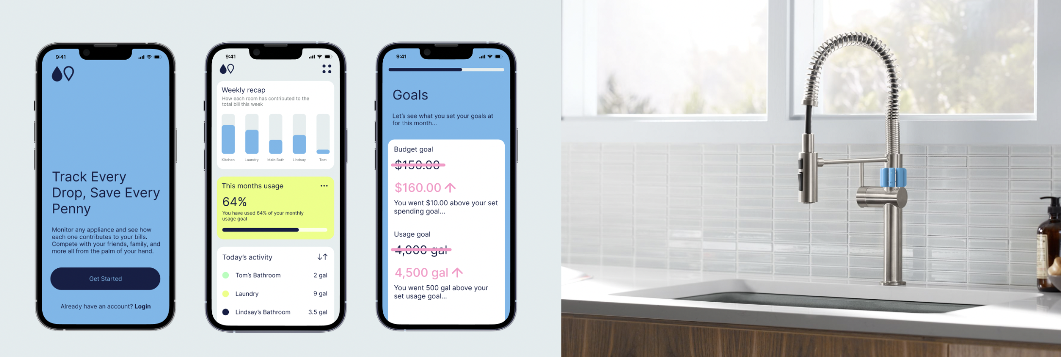
Simply attach Drip to the faucets or pipes you want to monitor, and sync them with the app. From there, your data will grow and show daily, weekly and monthly usage per room and appliance while also showing how it contributes to the household usage total and bill. Users can also set goals and compare with past usage to track their conservation efforts.

For packaging, I created a quick mock up of a “paper mache” like, recycled material that hugs the attachment inside. The idea was to keep it simple and eco friendly by limiting the amount of packaging as well as making sure to use recycled materials. Each unit included 2 attachments and were priced at $32.00. This price came from the products used as well as the manufacturing for all parts (including the packaging) while still leaving plenty of room for profit. We wanted to make sure to keep each pack cheap enough so encouraging customers to expand their system was reasonable.

Add household members
Share the same data across all household members devices by adding members to your “household”. Keep other people within household who aren’t the ones paying the bills aware of their individual usage. And see how individual's usage compares to others and how they contribute to the monthly usage and bill
Track usage by room
Track real time water usage by room and appliance in list form. Sort by recently used, highest usage by day, or lowest usage by day. See how each room compares by week and the break down by room if it contains more than one attachment
Set monthly usage and spending goals
The household admin has the ability to set usage and bill goals for the household that will be tracked as the month goes on. If the user isn't sure what goals are realistic for their household, they can take our quiz to help which takes into consideration many different factors such as household size, laundry frequency etc. Set a reminder to get notifications based on what percentage of your goal you have completed
Style guide

Product summary
Drip is a buildable water tracking system aimed to help with water conservation by encouraging usage awareness throughout the house. By displaying easy to understand metrics as well as monthly recaps across multiple devices, all members of the household will be aware of their usage and how it contributes as a whole.

How it works
By using magnetic sensors to calculate the flow rate of the water and the time it is in the pipes, we are able to offer a plumbing free, quick to install attachment that provides real time water usage data. With this new design, installation has never been easier. As long as the sensor is flush to the pipe, it will track the water flowing through and send that data back to your phone through its wifi connected chip.
To install simply adjust to fit your pipe or faucet, attach with the magnetic closure, and sync to the app with the press of a button.
5 months | Group
Project reflection
After working with my group of 2 designers, one business student, and one engineer, I was really able to see what it was like to start with nothing and create a product. It was very interesting to learn more about the business aspects of product design since I had no experience with it before. Although this was a lengthy project, time flew by once we knew what direction we wanted to go in.
Overall I am very happy with the way this project turned out and how my team was able to work together to create it.