More about:
LinkEV
WHEN
2023
MATERIALS
Figma
BACKGROUND
As someone who grew up in a car family, there were never ending lessons about car health and how to drive. However, a lot of these lessons also had to do with electric cars since more often than not it was my dad giving these lessons and he loves electric cars. With companies today starting to focus more on electric vehicles, it’s important to remember that not everyone was taught how to drive and or care for them (especially newer drivers). And if there was one thing I learned, it's that EV’s display a lot more information which is only useful when it's understood.
WHY
This vehicle connected app was created to help new or existing EV owners get better connected with their cars. The easy to navigate interface allows them to stay up to date with their battery health, teach them more about their driving habits, and help them get the most out of their EVs.
RESEARCH QUESTIONS
Before starting to think about my design, I first focused on seeing what pain points EV users had and what frequently asked questions I could find. After that I was able to decide what direction I wanted to go in and settled on a vehicle connected app that not only keeps users up to date on the state of their car, but also acts as a second remote. After that I moved on to looking at what other similar apps there were on the market to see what users felt worked or didn’t.
COMPETITIVE REVIEW

RESEARCH
Before I got started on wireframing, I did some research on other vehicle connected apps on the market. The main things I was looking at were what controls were included within these connected apps, and how certain information was displayed.
Since my main idea was to make sure there wasn’t too much of a learning curve for new EV owners, I felt it would be beneficial to look at both ICE and EV connected apps. By doing this, I can get a good idea of how to set it up in a similar way to reduce the time it would take the user to find certain things.
Some examples I looked at included Toyota, Tesla, and BMW. I noted what I thought worked and what didn’t design wise and then moved on to my wireframes. The main issue I noticed in these were how cluttered some of them were. I felt that they were trying to display too much unnecessary information on the main page making it frustrating to complete simple tasks.
Based off of what I learned, I was able to come up with some goals that I wanted my app to reach.
Goals:
1 Connection
Giving users a way to connect to their cars and access the stats from their mobile device.
2 Information
Easy to understand information for new users about EV driving habits and monitoring battery health.

3 Accessibility
Presenting users easy to use features that helps them get the most out of their EV experience and everything it has to offer.
DEFINING THE PROBLEM
New EV users who are unfamiliar with their EV’s need an easy, digestible way to learn about how they work and what they need while also learning how to navigate and utilize the special features they have to offer.
IDEATION

USER FLOW
To address the major pain points, I created this user flow chart to map out how users would get to each of the actions I outlined after my research. By doing this, I was able to play around with the placement of different features and make sure they are easily accessible before beginning to wireframe.

DESIGN

LO-FI WIREFRAMING


Once I had an idea of all the screens and paths I needed to design, I started with my lo-fi wires. I find that this is one of the most important steps when it comes to creating a hi-fi prototype. By keeping the design this simple in the early stages, it is easier to focus on usability and placement of content while also trying out multiple approaches.
Here is an example of my first iteration compared to my final. As you can see there was a lot of changes and refinement between the two, but I always find that my best ideas usually come after my 4th or 5th idea. After I settled on my final wireframe designs and created all of the pages I needed to meet my key actions, I moved onto color.
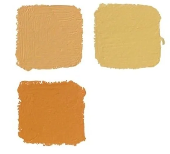
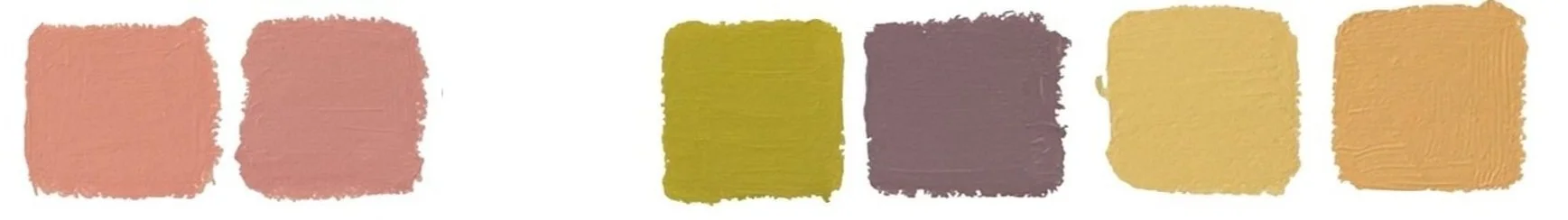
STYLE GUIDE
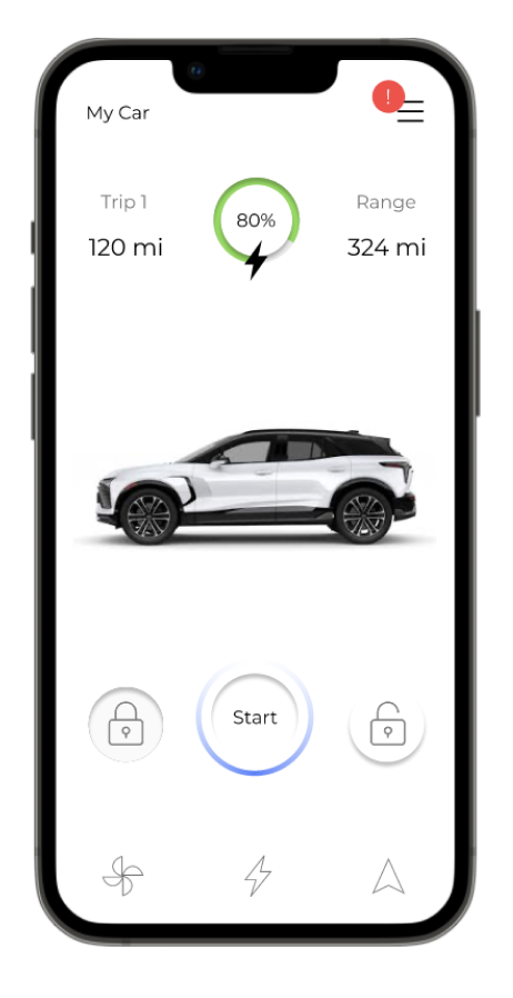
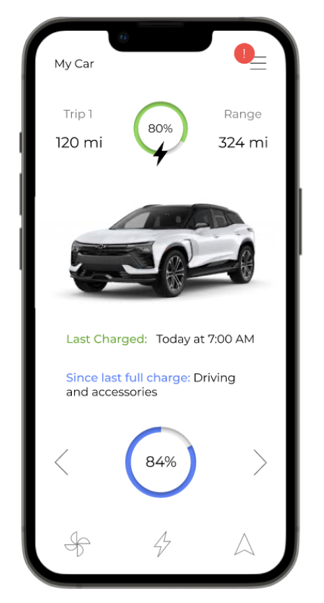
HI-FI KEY DESIGN FEATURES
For my final design, I created a hi-fi prototype that addressed the pain points that came out of the inital research. After many lo-fi iterations and a few hi-fi drafts, I was able to come up with a fully stylized prototype with a simple design and color scheme that is easy to understand and not too overwhelming.
Each of my goals was met through my design as you will see below.
1 Connection
Goal: Give users a way to connect to their cars and access the stats from their mobile device.
Solution: An app design that allows users to not only use their phones as their remotes, but also gives them access to their vehicles stats and charging details no matter where they are.
2 Information
Goal: Teach users about EV driving habits and monitoring battery health.
Solution: By organizing the car stats in specific sections, users are less likely to be overwhelmed by all of the information and more likely to take the time to understand it. On top of that, I also included a warning light key which is located in the menu bar and is accessible from any screen incase of emergencies.

3 Accessibility
Goal: Give users easy to use features to help them get the most out of their EV experience.
Solution: Since electric cars are so new to the market, they often have newer high-tech features users don’t know about. One example of this is the battery usage breakdown that helps drivers see what is using the most energy. By keeping track of this, users can adjust and get even more out of their charge.
LINKS
REFLECTION
After spending weeks on this project, I am very proud of the way it turned out. It was fun working on and researching a topic I enjoy and was very excited to show it to my family. Throughout this process I did my best to learn everything I could, using the resources I had available, and I am happy with the overall outcome.
I would be interested in going back and making some edits after gaining some professional experience at General Motors the following summer. I did a lot of work similar to this and got to contribute some of their own vehicle connected apps. I think if I went back and used some of the research and design skills I learned during my time there, I could make some changes that would take this design to the next level.